Specify Color Last, But Not Least
Of all of the design elements, color is the most vital and expressive. Without color, our sense of self, our homes, fashion, automobiles and internet would be a vast colorless void. It is for this reason professional interior designers are required to possess a thorough knowledge of color history, color theory, color schemes and applications when planning interior environments.
The History of Color
Since early humans first began to draw images and markings on cave walls by crushing earth and other natural materials like vegetable and insect matter to produce colors, man has used color to adorn his surroundings. The Egyptians were the first to really appreciate the full impact of color by crushing minerals such as hematite (red), orpiment (yellow), malachite (green) and cobalt (blue) to detail their interiors such as columns and wall frescos. Roman interiors were highly decorated with bold color covering the majority of interior surfaces. Murals found in Pompeii were even more sophisticated in the use of pigments to make color that produced softer tones that worked more harmoniously together. Over the centuries, new pigments and mediums were used as technology developed to mix and apply color to interiors, decorative arts and all products. Today we easily live with color and its availability, allowing us to flow with color trends and fashion, with an emphasis on the quality and texture of modern colors.
Color Theory
The definition of color theory for the visual arts is an explanation of specific color combinations and the mixing of color itself. This theory dates back to the 15th century, with Leonardo DaVinci writing about it amongst others. Sir Isaac Newton was the first to understand the rainbow by refracting white light through a prism and breaking it into its component colors. It was Newton who developed the color wheel, with which most everyone is familiar. The wheel is a circular diagram that groups colors together that both harmonize and clash with one another. Colors are broken down by primary, secondary and tertiary hues to further organize how color is mixed to create others.
The Human Physiology of Color
Our human physiology in the perception of color lies with each human’s distinct response by the receptors, or cones, in our retinas. Each of us sees color differently based on the brain’s conversion of light emitted from an object. For example, on person’s vision of the hue “beige” might be another’s “peach”, based on the light into the eye’s cones and our individual brain conversion. We all react differently to the same color due to previous experiences and behaviors as well.
Color affects our moods and feelings, affects the perception of weight, size and even temperature. Color can create an atmosphere of calmness, or evoke stimulation and liveliness. Color cannot only reflect our personality but also our multi-cultural diversity. Color has many different meanings from one society to the next, and has a variety of effects on our psychology as well. The follow are examples of color and their proven psychological effects:
- RED – danger, passion, love, excitement, anger, fire and strength
- YELLOW – sunlight, warmth, optimism and enhances communication
- ORANGE – cheerfulness, sunset, stimulation
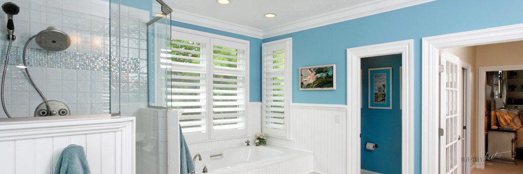
- BLUE – honesty, truth, formality, loyalty, masculinity
- GREEN – nature, serenity, hope, envy, peace, security, hope
- VIOLET – royalty, power, drama, mystery, worship
- WHITE – purity, cleanliness, sterility, freshness
- BLACK – mourning, sorrow, sophistication, magic, night
- GRAY – storm, intelligence, wisdom, business, high-tech
- BROWN – earth, wood, comfort, support, stability
Color Schemes
Organizing color theory into color schemes for today’s interiors is both challenging and satisfying. Color combinations are endless; your interior designer should explore and cater to your individual color scheme preferences. Great rooms are professionally designed with one of the following five color schemes:
- ACHROMATIC color schemes are created utilizing black, white and/or variations of gray. There is no identifiable hue, only values [hue = name of the color, value = lightness or darkness of the hue]. Designers specify accent colors in art, accessories, textiles or foliage to enhance and contrast against this color scheme.
- MONOTONE color schemes are created from a color with low intensity or saturation of pure color. Typically, these are characterized by neutralized colors, which fall half way between warm and cool colors. Monotone colors include hues like beige, creams and tans. These neutral schemes are applied to sophisticated and relaxed interiors where accent colors in a stronger chroma can be applied to smaller furnishings and artwork for added visual interest.
- MONOCHROMATIC color schemes are developed from a single hue with a range of values and degrees of intensity. The variety in this scheme comes from applying lighter neutralized tones for large wall areas, deeper tones for flooring materials, medium tones for primary or large furniture and vivid tones on accent pieces. Designers enhance this scheme use of pattern and texture from fabrics, wood, stone, metal or glass. Injecting black or white elements sharpen the look and add interest.
- ANALOGOUS color schemes are derived from using colors side-by-side on the color wheel but no more than half the colors on the wheel. For example, yellow, yellow-orange, orange and red could be a potential analogous color scheme. Harmony is best established because generally, one dominant color is present. The best effect is where a great variety of values and intensities of the hues are employed.
- COMPLIMENTARY color schemes or contrasting color schemes are used widely because of the amount of variety offered in the scheme combinations. Hues for this scheme are chosen from opposite points on the color wheel. These schemes always contain both warm and cool colors. Designers always make one hue dominant because equal amounts create an unpleasant atmosphere in the space.
Application Tips for Paint and Color
As a professional interior designer, the wonderful chance to apply color in my projects comes in many forms. Applications range from fabrics, furniture finishes, artwork, accessories, lighting, flooring, cabinetry, countertops, appliances, tile work; the list goes on and on. Of course, walls, ceiling and trim are obvious outlets for a designer and homeowner to express color with the least expensive interior magic: paint.
Today’s paint market is wider and more dynamic than ever. With alkyds quickly being replaced by latex based acrylics and many paints being reformulated for environmental concerns, it makes for a dizzying array of choices for the consumer.
A few of my best tips for choosing paint bases include:
- Buy the best paint you can afford. Go with top of the line products from proven companies like Porter and Benjamin Moore for best results and a happier painter.
- Carefully consider sheens when specifying paint. The higher the gloss, the more durable the paint. Woodwork gets repainted the least often, so use a minimum of semi-gloss or full gloss products. I still recommend a classic sheen scheme because it still works: Flat ceilings, Egg Shell walls and Semi-Gloss Trim.
- The best finished paint job always starts with the substrate condition and careful preparations of all surfaces. Correct primers must still be used in most all cases.
- Leverage paint representatives and interior designers for expert recommendations.
A few of my best tips for applying color in residential interiors include:
- Try tinted ceilings – it’s not all about white ceilings anymore even in traditional environments
- Create single accents walls in bold or deep color to draw you in or anchor a wall in a space
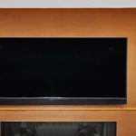
- Use darker colors in bedrooms to convey serenity, and keep baths light for function
- In contemporary environments, consider painting walls, trim and ceilings in the same color for the cleanest backdrops
Don’t Follow Trendy Colors
Color trends are everywhere around us. Shelter magazines, paint stores, home stores and color marketing groups all offer us advice on the latest and greatest color trends. Color actually sells products these days and is big business, so there will always be someone telling you what trendy color to buy next. While some pre-selected color palettes are appealing and work for people with no eye for color, there is much more to be said for self expression in your home environment. Consider hiring a professional interior designer to help you identify and apply your own favorite colors to your spaces for a more custom, tailored approach you will enjoy for years to come.
Color is Last, But Not Least
My very best tip for paint color: Make it the very last specification for a space.
I often get asked by clients to call paint colors early in the project when creating their custom design plans, so they can knock out the backdrop painting early on. Color should be inspired by all other materials in the space, and the room should be completely designed first. When I specify interior colors, I pay particular attention to hard installed merchandise that will not change quickly like floors, cabinets, and the like to marry color best. Loose materials such as textiles, artwork or even a great rug may also become the final inspiration for paint colors. The point is to design the room completely, get samples of all materials then lay it out with a fan deck and your favorite designer on hand. You will be glad you did.
Please feel free to contact us via telephone at (317) 357-0155 with any questions about this material or to request more information about our services. Visit the It’s YouTM section on our website at www.jeffsheatsdesigns.com to learn more about the Jeff Sheats Designs, Inc. interior design process. We are your partners in interior design.